The need
Let's Project brings parties and festivals, regular community meetups and the Let's Crew DJ academy under one brand. Each speaks to a different audience.
The brief was a site that conveys the brand's energy on the first screen, separates each programme clearly and leads visitors to sign up in the app.
What we built
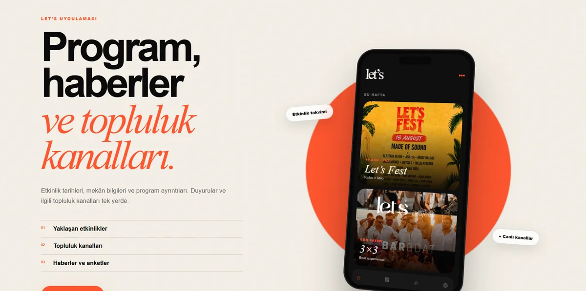
We carried the language of the brand's event posters onto the site with a dark base, orange accents and large italic headlines. Community meetups, the DJ academy and events each get their own card with their own photography.
The event archive links to Instagram posts, so the site stays current with every new event. The app section sends visitors straight to sign-up with App Store and Google Play links.
Key features
Poster-style design
A dark base, orange accents and large type speak the same language as the brand's event posters.
Built around programmes
Community meetups, the DJ academy and events each have their own card and message.
Event archive
Past events are shown in a gallery linked to Instagram posts.
Leads to the app
The sign-up call and App Store and Google Play links appear at several points on the page.
Sections in motion
Scrolling marquees and sections that open on scroll add event energy to the page.
Responsive
On phones the page turns into a single column, with main buttons sized for the thumb.
Results
- Live at letsproject.tr.
- Leads visitors to the App Store, Google Play and the web app.
- Works in desktop and mobile browsers.